History
Logo Elements
Phra Pang – พระปาง


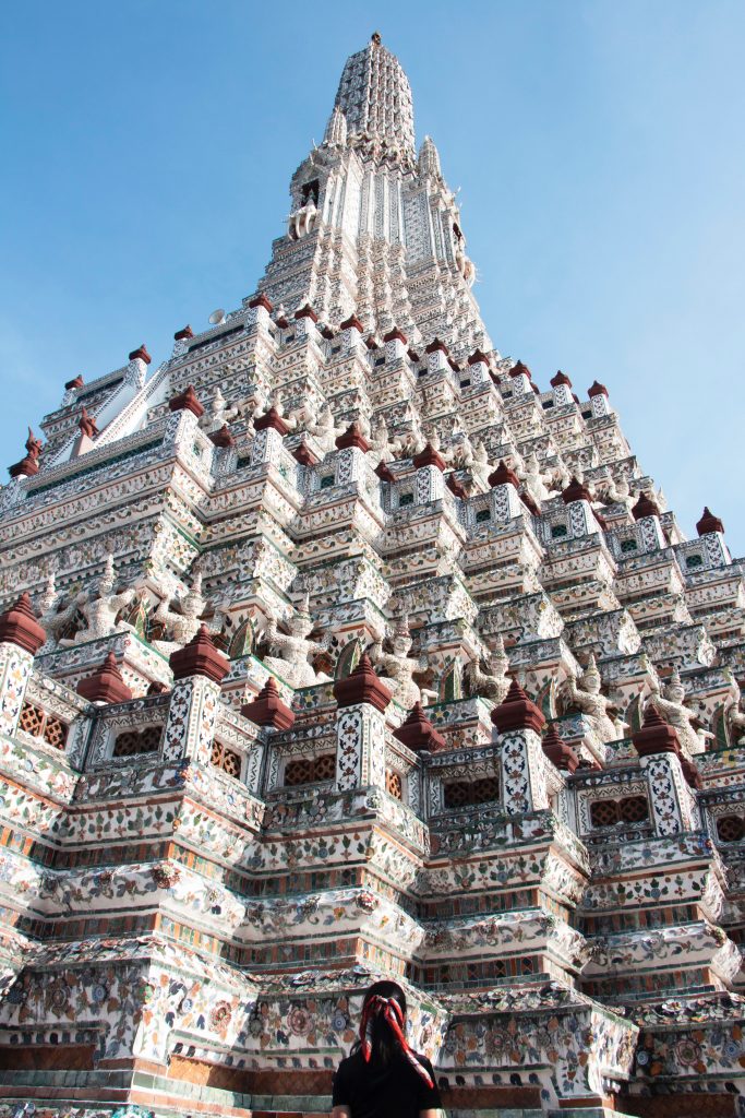
B.Grimm’s logo comes from the Phra Prang of Wat Arun (‘Temple of Dawn’).
A prang is a Buddhist tower-like spire, usually richly carved, that was especially symbolic during Thailand’s Ayutthaya Kingdom (1350–1767) and Rattanakosin Kingdom (1782-1932).
B.Grimm & Co.’s Phra Prang was designed with Phra Prang of the Temple of Dawn as its prototype. Phra Prang was selected as the company’s logo due to the location of the first B.Grimm & Co. by the Chao Phraya River overlooking the splendid Phra Prang of the Temple of Dawn. This vision symbolized the dawn of B.Grimm & Co.’s business prosperity.
The original version of B.Grimm & Co. logo illustrated Phra Prang on the first tier with “B.Grimm & Co.” scribe and second tier with “บี.กริม” scribe. Phra Prang was situated on the double-tier and under it, 1878, the year of company establishment. On top of Phra Prang, a delicate pattern of gable apex is decorated.
Later on, the commercial symbols became more modernized leading B.Grimm & Co. to modify its logo to reflect more international stance. Some adornments were removed for easier recognition but the overall pattern remained.
โลโก้ของ B.Grimm มาจากพระปรางค์ของวัดอรุณ (‘วัดอรุณ’)
ปรางค์เป็นรูปยอดแหลมคล้ายหอในพุทธศาสนาซึ่งมักจะถูกจารึกอย่างมั่งคั่งซึ่งเป็นสัญลักษณ์โดยเฉพาะอย่างยิ่งในช่วงอาณาจักรอยุธยาของประเทศไทย (ค.ศ. 1350–1767) และอาณาจักรรัตนโกสินทร์ (พ.ศ. 2325-2475)
พระปรางค์ของ B.Grimm & Co. ได้รับการออกแบบโดยมีพระปรางค์ของวัดอรุณเป็นแบบอย่าง พระปรางค์ได้รับเลือกให้เป็นโลโก้ของ บริษัท เนื่องจากที่ตั้งของ บริษัท บี. กริมแรกและ บริษัท ริมแม่น้ำเจ้าพระยาสามารถมองเห็นพระปรางค์อันงดงามของวัดอรุณ วิสัยทัศน์นี้เป็นสัญลักษณ์ของรุ่งอรุณแห่งความรุ่งเรืองทางธุรกิจของ B.Grimm & Co.
…
…
…
Color Orange – พระปาง
ORANGE


The orange color relates to a dawn moment of the sky and links to the name “Temple of Dawn”.
โลโก้ของ B.Grimm มาจากพระปรางค์ของวัดอรุณ (‘วัดอรุณ’)
ปรางค์เป็นรูปยอดแหลมคล้ายหอในพุทธศาสนาซึ่งมักจะถูกจารึกอย่างมั่งคั่งซึ่งเป็นสัญลักษณ์โดยเฉพาะอย่างยิ่งในช่วงอาณาจักรอยุธยาของประเทศไทย (ค.ศ. 1350–1767) และอาณาจักรรัตนโกสินทร์ (พ.ศ. 2325-2475)
พระปรางค์ของ B.Grimm & Co. ได้รับการออกแบบโดยมีพระปรางค์ของวัดอรุณเป็นแบบอย่าง พระปรางค์ได้รับเลือกให้เป็นโลโก้ของ บริษัท เนื่องจากที่ตั้งของ บริษัท บี. กริมแรกและ บริษัท ริมแม่น้ำเจ้าพระยาสามารถมองเห็นพระปรางค์อันงดงามของวัดอรุณ วิสัยทัศน์นี้เป็นสัญลักษณ์ของรุ่งอรุณแห่งความรุ่งเรืองทางธุรกิจของ B.Grimm & Co.
…
…
…
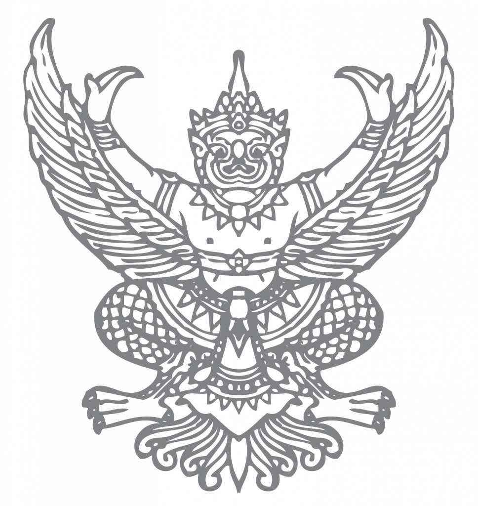
Emblem
In 1926, HM King Chulalongkorn was granted the “Dra Arm” to B.Grimm as the official pharmacist to the Royal Family. The emblem was later changed to the “Garuda”, which still appears in the B.Grimm logo.
พระปาง
โลโก้ของ B.Grimm มาจากพระปรางค์ของวัดอรุณ (‘วัดอรุณ’)
ปรางค์เป็นรูปยอดแหลมคล้ายหอในพุทธศาสนาซึ่งมักจะถูกจารึกอย่างมั่งคั่งซึ่งเป็นสัญลักษณ์โดยเฉพาะอย่างยิ่งในช่วงอาณาจักรอยุธยาของประเทศไทย (ค.ศ. 1350–1767) และอาณาจักรรัตนโกสินทร์ (พ.ศ. 2325-2475)
พระปรางค์ของ B.Grimm & Co. ได้รับการออกแบบโดยมีพระปรางค์ของวัดอรุณเป็นแบบอย่าง พระปรางค์ได้รับเลือกให้เป็นโลโก้ของ บริษัท เนื่องจากที่ตั้งของ บริษัท บี. กริมแรกและ บริษัท ริมแม่น้ำเจ้าพระยาสามารถมองเห็นพระปรางค์อันงดงามของวัดอรุณ วิสัยทัศน์นี้เป็นสัญลักษณ์ของรุ่งอรุณแห่งความรุ่งเรืองทางธุรกิจของ B.Grimm & Co.
…
…
…